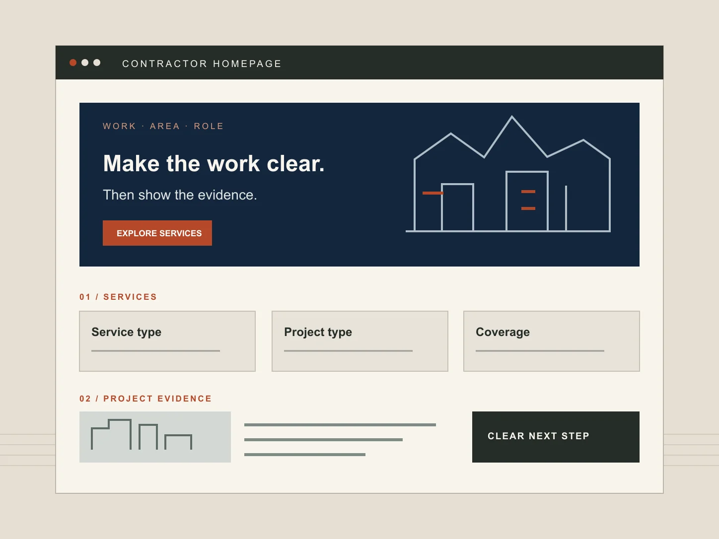
A construction company homepage has a narrow job. It should help a prospective client recognise the kind of work you undertake, see whether you cover their location and find credible evidence before they spend time on an enquiry. It cannot carry every project, service detail and qualification the business has accumulated.
This is a guide to the homepage and its order of information. Our broader construction website checklist covers the rest of the site, including individual service pages and ongoing content maintenance.
Make the first screen useful to the right visitor
The opening view should identify the business in ordinary language: the work, the customer or project type, and the area served. A sentence such as “Quality construction solutions across the UK” leaves all three questions open. If the business specialises in occupied-building refurbishment in Greater Manchester, that is more useful information than a broad claim to do everything.
An illustrative opening might say: “Commercial refurbishment for occupied buildings across Greater Manchester.” A short supporting line could clarify whether the company is a principal contractor, specialist subcontractor or design-and-build provider. The primary link should lead to the relevant service or a manageable project enquiry. This is a copy pattern, not a claim about a real company.
Choose an image that helps explain the work. A completed façade may be right for an envelope contractor; a site team carrying out a live refurbishment may better represent a specialist working around occupied premises. A generic skyline says little. Check that the words and primary link remain legible when the image is cropped on a phone.
Put services and project types within one clear step
Visitors often arrive with a project in mind, not with knowledge of the contractor's internal divisions. Give the homepage a compact route to the services they can actually buy. “Building works” is too broad if the business really provides planned maintenance, fit-out and structural alterations. Use familiar labels, each linking to a page that explains scope, exclusions and the next decision.
Project types can sit alongside services when they change the buying question: schools, industrial units and occupied offices may involve different constraints. Avoid duplicating the same card under both headings. If a sector page has no distinct evidence or process to explain, it may not need to exist.
State geographical coverage accurately. A regional base with national projects is different from a standing nationwide delivery team. If travel or project size affects the work accepted, explain the boundary at the appropriate level of detail. This helps a visitor judge fit before the sales team has to correct an assumption.
Show evidence close to the claim it supports
A homepage can introduce two or three representative projects, then link to fuller accounts. Give each project a useful caption: the type of work, your role, a relevant constraint and the location where it may be disclosed. “Award-winning transformation” is weaker than an approved account of what the firm actually delivered.
For example, a photograph of a refurbished workshop could be captioned with the contractor's own package, the occupied-site constraint and the completion stage shown. It should not imply responsibility for the whole project if the firm supplied only one element. Our construction project case-study guide sets out how to write the full account without inventing results.
Use genuine photographs with permission and a short, informative caption. A wide site photograph can show scale; a closer process image may explain specialist workmanship. Do not rely on an image alone to prove safety, quality or capacity. If client names, locations or people are confidential, agree what can be published before the page goes live.
Place credentials where they answer a question
Qualifications, memberships and accreditations can matter, but a strip of logos without context asks visitors to infer too much. Say which legal entity holds a credential, what work or location it covers, and whether the evidence is current. If a project needs a particular qualification, put verified detail on the relevant service page as well as a concise homepage signpost.
Testimonials are useful only when they are authentic, approved and specific enough to help a reader. A comment about communication during an occupied-site project says more than an unattributed “excellent service”. Do not turn a private client email into a public endorsement without permission. Where no usable testimonial exists, a clear project account is a stronger choice than a fabricated quote.
A practical homepage sequence
There is no universal template, but this order gives a visitor a sensible path from recognition to evidence and contact. A smaller contractor can combine sections rather than adding empty blocks.
- Opening statement: service, customer or project type, coverage and one clear next step.
- Service routes: the distinct types of work with links to detailed pages.
- How the company works: a brief account of its role, delivery model and relevant constraints.
- Selected projects: approved evidence that matches the work the business wants to discuss.
- Verified trust details: current credentials, relevant people or a genuinely useful client comment.
- Service area: a clear statement of where the company operates, if this was not fully explained above.
- Enquiry route: what to send now, what happens next and an alternative contact method.
The homepage should point to maintained detail, not become a compressed version of every page. If visitors need technical information or a tender-specific document, give them a route to the right person or resource rather than burying it in a long opening section.
Test the path on a phone before adding more content
On a narrow screen, the first photograph may take the entire view while the useful words sit below it. Check the actual reading order. Can a visitor reach the service list, project evidence and contact route without opening several unrelated menus? Are tap targets comfortable and are phone numbers readable and actionable?
A first enquiry need not be a complete tender submission. Ask for enough to route it: contact details, project type, location, a short description and indicative timing where useful. For more involved requirements, the construction enquiry form guide explains how to separate essential fields from later questions. Specialist fabrication work may need a different route for drawings and revisions; our fabrication RFQ guide covers that handover.
Before launch, ask someone unfamiliar with the site to find a relevant service, identify a comparable project and explain how they would make contact. Note where they hesitate. Revise the labels and order before adding another homepage section.
What to leave off
Avoid automatic image carousels that hide the most relevant project, claims that cannot be substantiated, and client logo grids with no explanation of the work. Old project counts and “latest news” blocks are liabilities if nobody owns their updates. A quiet homepage with current information is more useful than a busy page whose strongest proof is hard to find.
The test is simple: can the right customer understand your work, recognise evidence for it and choose a proportionate next step? If the homepage does that, the deeper pages can take over. Our construction website service shows how we approach that structure for contractors and specialist firms.